This project enabled a fundamental shift: moving from reading static reports to exploring employee data as a mindset. I worked closely with talented developers and data scientists who helped transform complexity into something users could actually explore and understand.
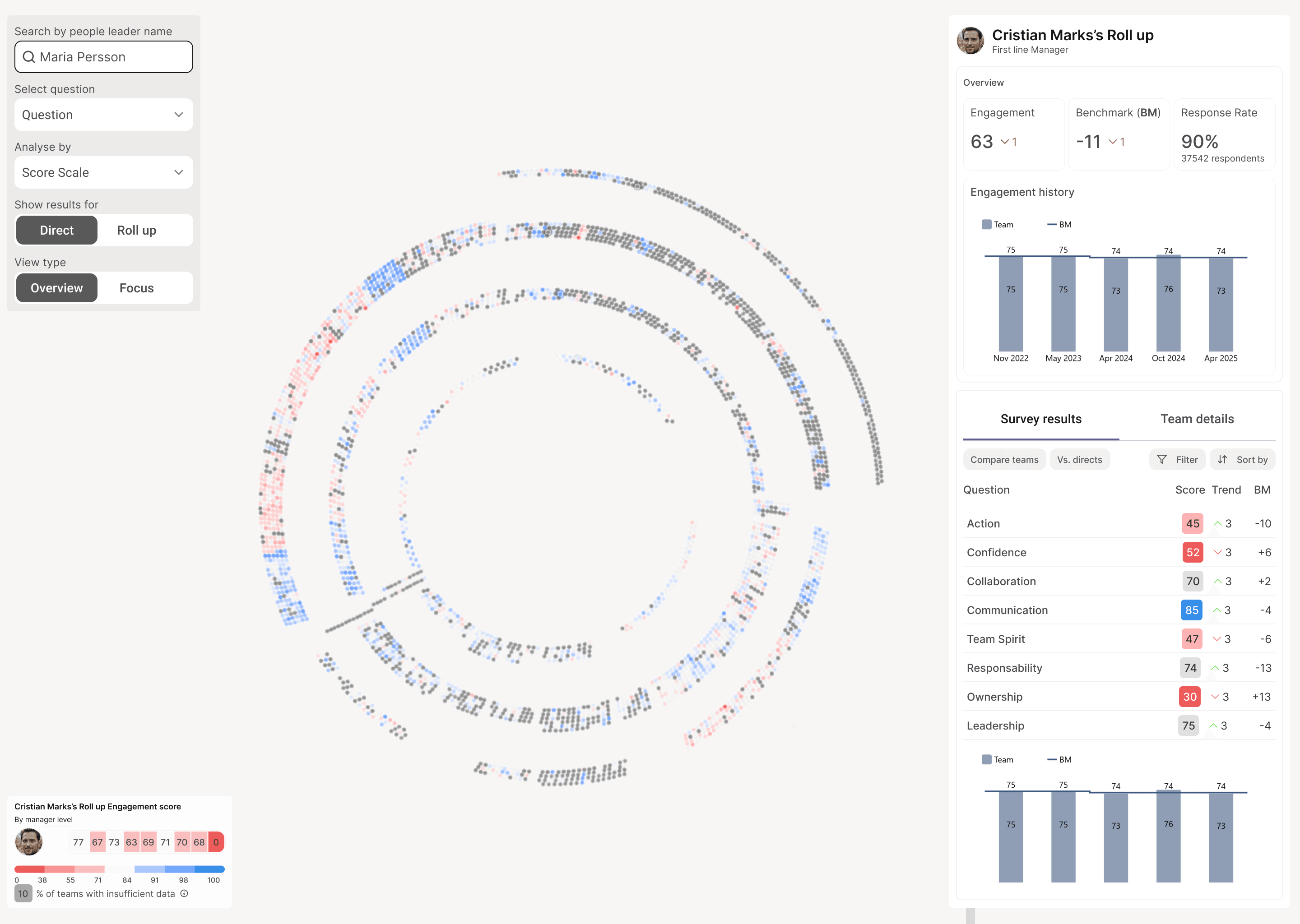
The final solution in production
TL;DR
Context: At a global automotive company with 42,000+ employees, this product helps HR teams discover patterns in pulse survey data—engagement, team health, and organizational trends.
The challenge: Data lived in silos. Analysts built manual "collages" across PowerBI, Excel, and presentations just to answer simple questions. This took weeks of report-building—energy that could have been spent analyzing the data instead of wrangling it.
My approach: Graph-based exploration where the org chart becomes navigation. Three work zones (Filter → Navigate → Analyze) enabled self-service pattern discovery for HR teams and managers—not just analysts.
Impact: 200+ immediate adopters, analysis time from weeks to hours, zero custom dashboard requests. Users shifted from passive consumers to active explorers—requesting new features unprompted.
Role: UX Designer + UX Engineering | Timeline: 7 months | Team: 2 developers, 2 data scientists
The strategic problem
We needed to make sense of scattered data and see the story behind employees’ journeys—growth, stagnation, engagement patterns. But survey data lived in disconnected PowerBI dashboards and Excel exports.
A data leader saw the gap: we had the data, but not the means to discover patterns. What we needed was a way to bring an exploration tool to dive in to relationships, compare across teams, and drill through organizational layers without losing context.
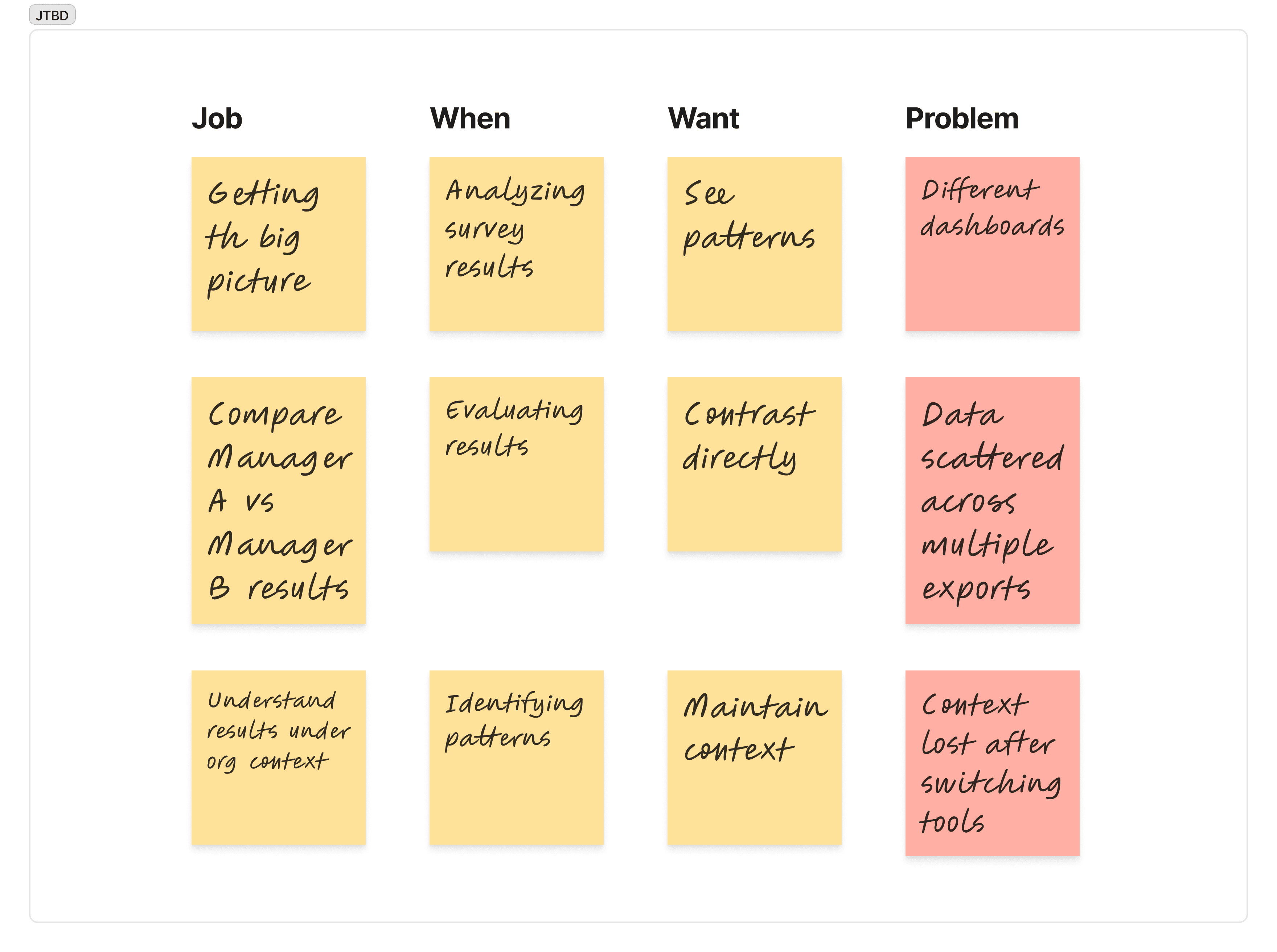
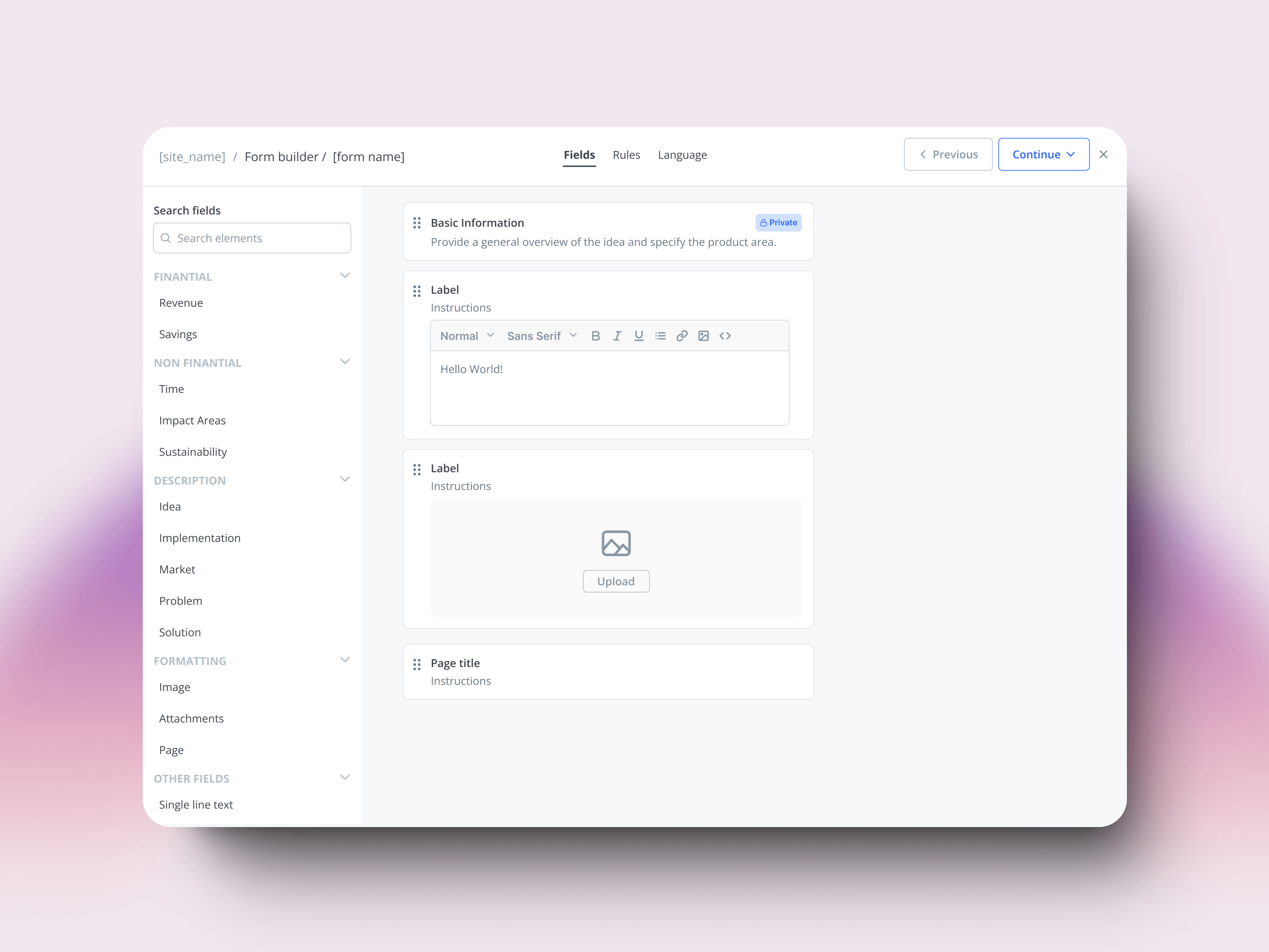
Some of the core jobs/questions for the HR and managers
Design strategy
Enable exploration, not just visualization
Traditional dashboards are for consumption. We needed exploration—drill down, notice patterns, ask new questions, repeat. This led to organizing the interface around three clear purposes:

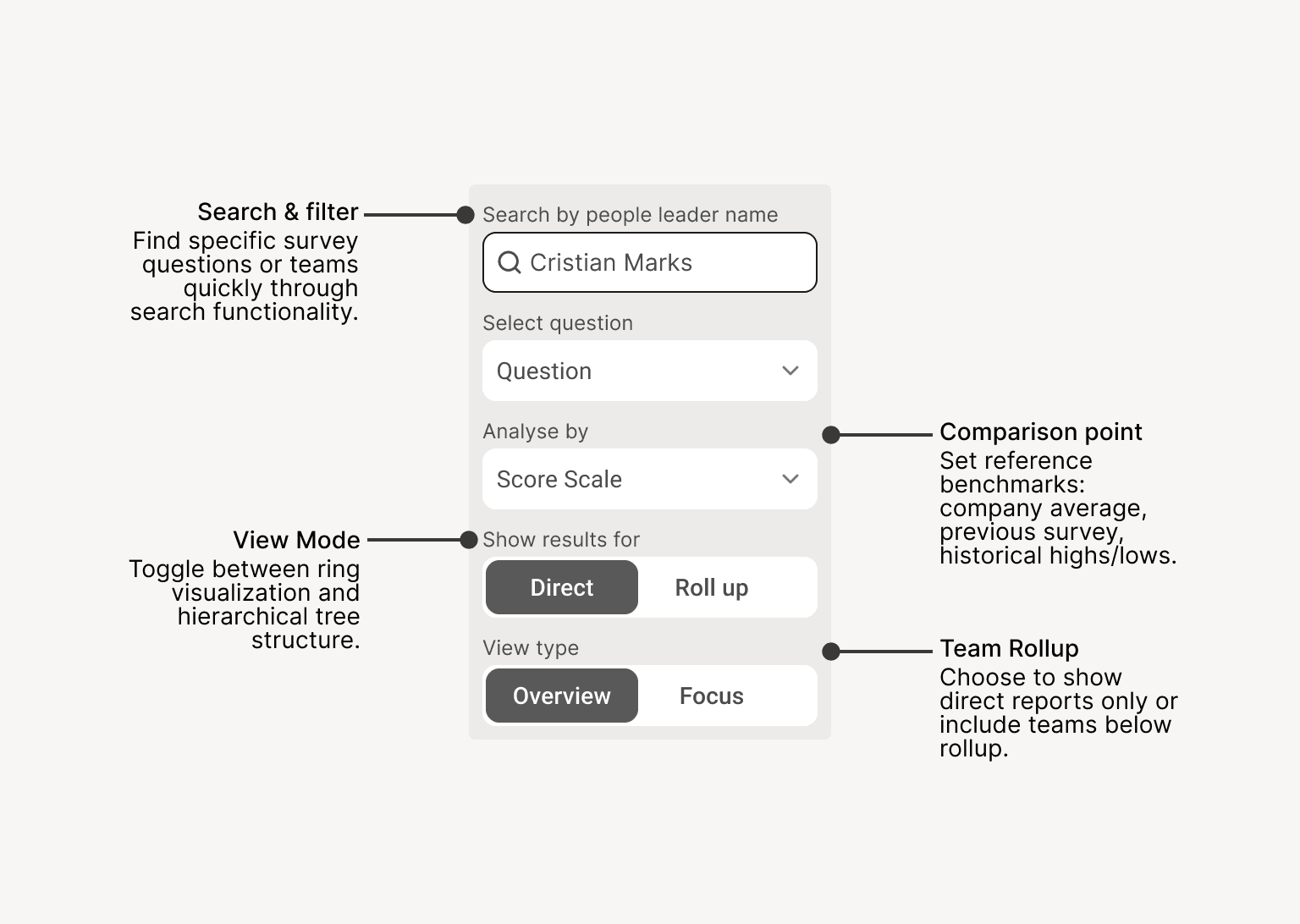
Filter (left)
Control what you see
Navigate (center)
Move through data spatially
Analyze (right)
Examine details without losing context
Each zone served a specific purpose in the exploration workflow:
Left Panel: Filter & Control
This is where you shape what you see. The left panel controls all data filtering and visualization modes. Every change here updates both the central graph and the detail panel in real-time, letting you manipulate the data without losing your place in the exploration.
Bottom Panel: Legend & Context
This panel keeps you oriented. It provides the visual key to understand what colors and values mean in the graph above, while also surfacing contextual metrics—like ring averages—that help you spot patterns around the team you're currently exploring. Everything shown here is relevant to your current selection, avoiding information overload.
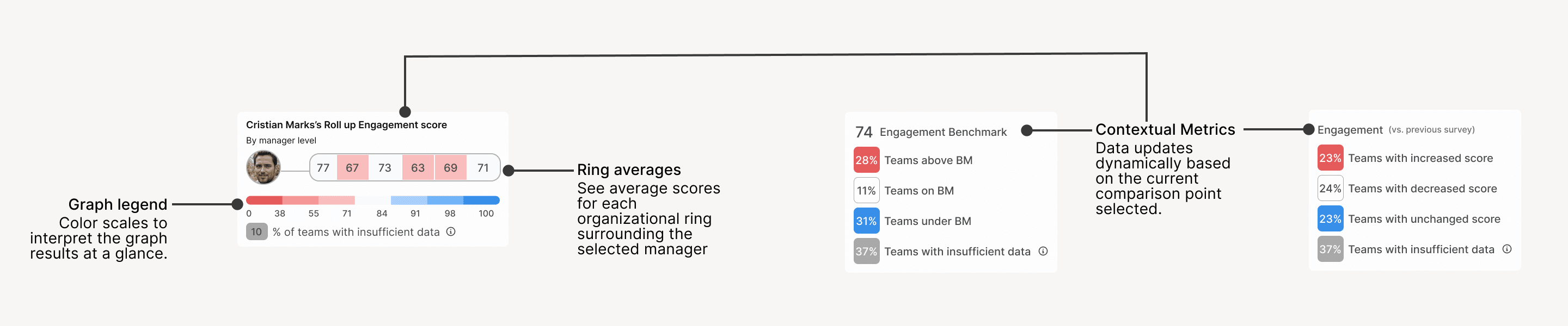
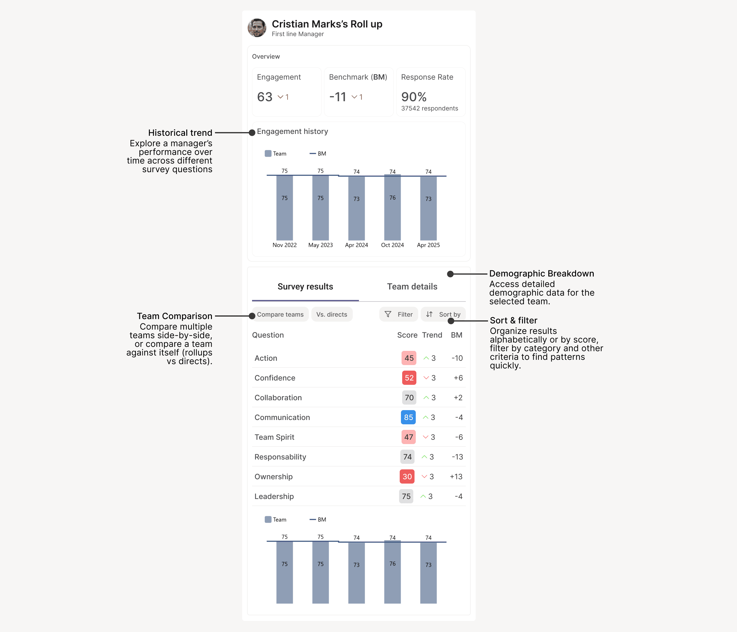
Right Panel: Drilling Data
This is where insights come to life. The right panel reveals detailed metrics for whatever you're exploring in the graph. Drill into historical trends, compare teams, or analyze demographic patterns—all without switching tools or losing context of your current selection.
Key decisions
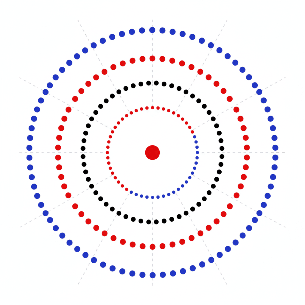
Two visualization modes—each with purpose
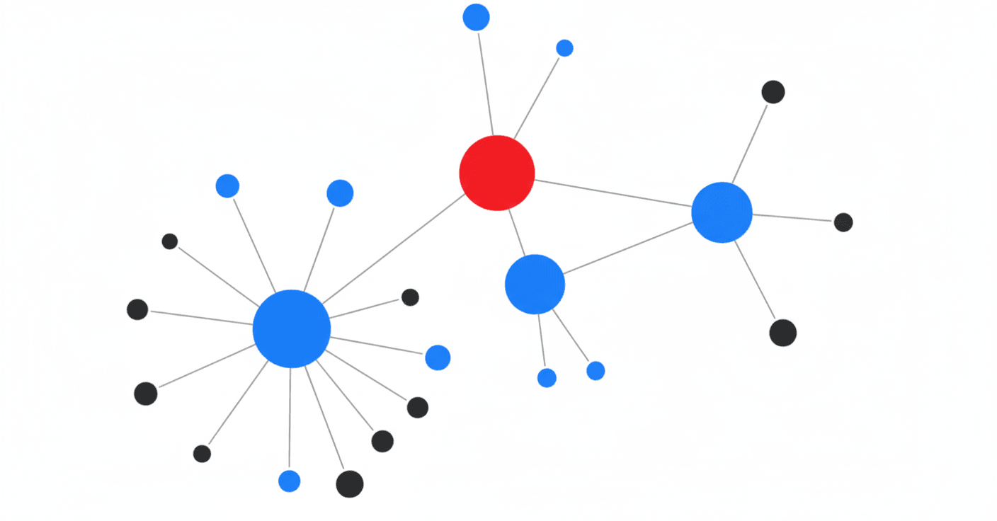
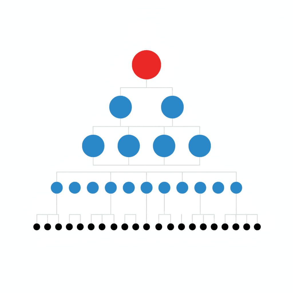
Initially, we had ring visualization with nodes for drilling down. During usability testing, users understood the rings for big-picture patterns. But when they clicked into a team, the node-focused view confused them—they didn't know how to navigate it. They expected something hierarchical, like tools they already used.
The solution: Replace nodes with tree view. Ring mode for overview, hierarchy mode for focus. Users toggle based on task. Innovate where it creates value (navigation), stay familiar where it reduces friction (structure).
Cutting the "impressive but useless"
With two visualization modes working, we got ambitious. The data science team proposed showing average scores for every organizational ring in a bottom panel. "Users can spot outliers instantly!"
When we tested it, everyone was lost. Nobody understood what the data meant, that’s when we knew we had to strip everything back.
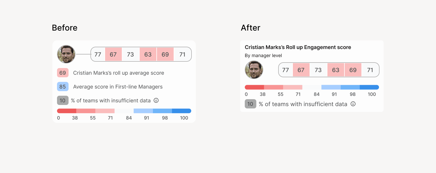
I reduced it to essentials—contextual legend and ring averages only for the selected team. Nobody missed the rest.
The pattern: Technical capability doesn't equal user value. Design for adoption, not admiration.
Impact
200+ active users adopted immediately. Analysis cycles dropped from weeks to hours. But the real shift: users started requesting new features unprompted—they'd internalized exploration as habit.
What I learned
Strategic design is about enablement, not aesthetics. If nobody can use it, it doesn't matter how smart it is.