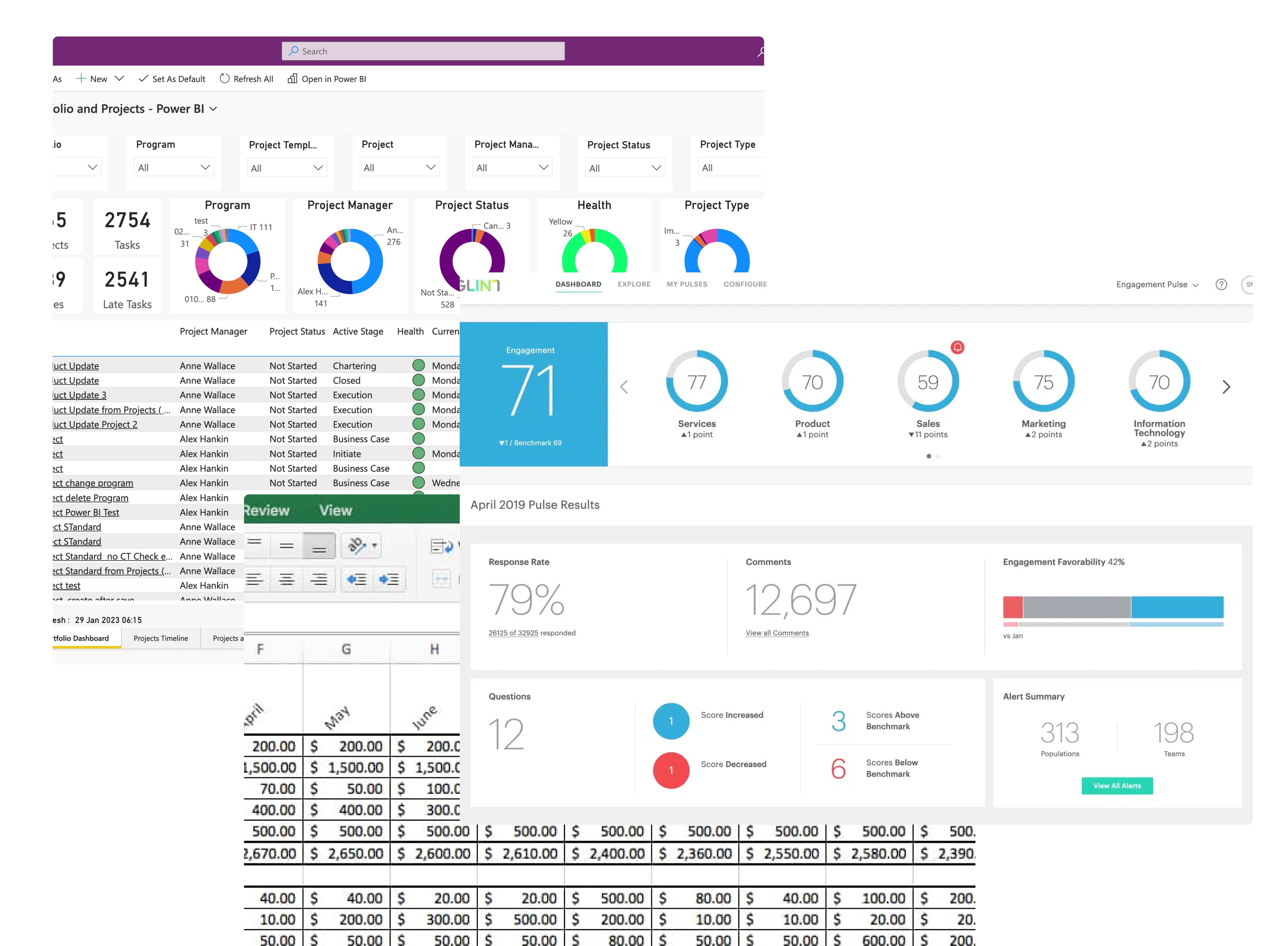
HR engagement data at a 42,000-person company lived across three tools: Glint, PowerBI, and Excel. Each one showed a fragment.
To answer questions like "how are managers at the same level performing under this leader?" or "what's the trend on accountability for this manager, and when did it hit its lowest?" — HR partners filed a request and waited. One data analyst told us she'd spent weeks building a single dashboard before handing it off.
The problem wasn't access. Every tool was built to display answers, not explore questions. So we built one that did.
THE PROBLEM
Three tools, zero context
Glint showed survey scores. PowerBI showed org-level trends. Excel held the manual cross-cuts data scientists ran on request. Each tool was useful in isolation. None let an HR partner notice a pattern and follow it.
Cross-analysis meant filing a request. Most questions never got asked.
THE DESIGN
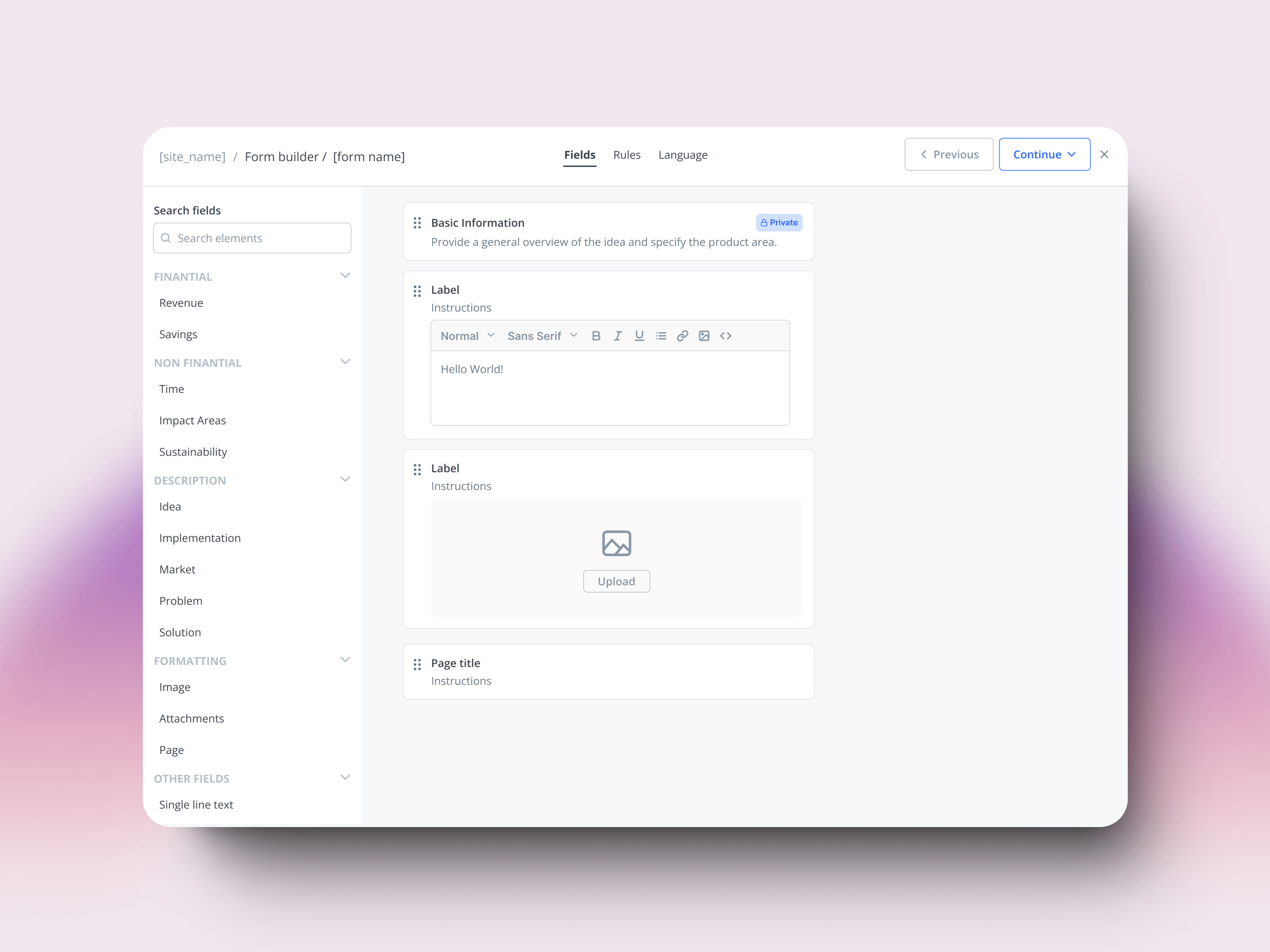
Three zones, one clear purpose each
Traditional dashboards are organized around what data exists. This needed to be organized around how exploration actually works: drill down, notice patterns, ask new questions.
Three zones, each with one job. They never compete for attention.
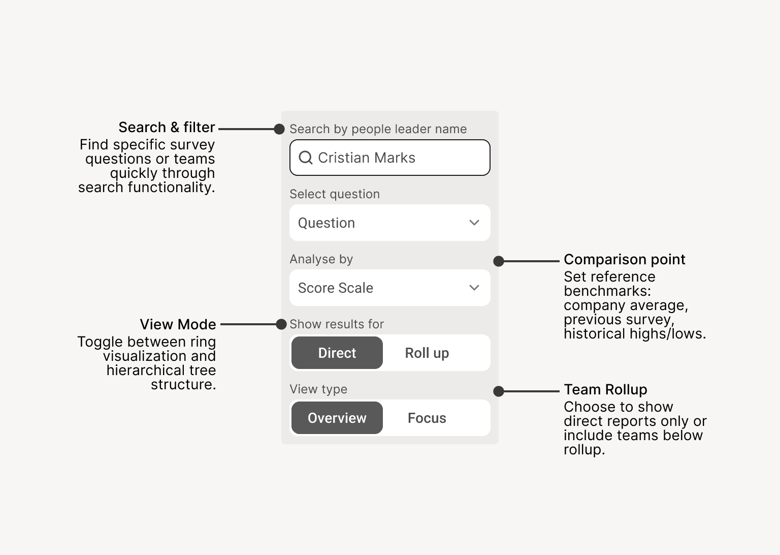
Filter + Legend
Control what you see
Navigate
Move through data spatially
Drill down
Examine details without losing context
THE HARDEST DESIGN PROBLEM
Five variables, without turning it back into a dashboard
Exploration needs control. But every control we added pulled the tool back toward dashboard logic — show everything, all the time, in case someone needs it.
Five variables had to coexist: who you're looking at, which question, granularity, comparison point, view mode. Any change had to feel like the same thought, refined — not like switching screens.
One control panel, everything reactive in real time. No "apply filters" button, no reload.
DETAIL THAT MATTERS
What we almost shipped
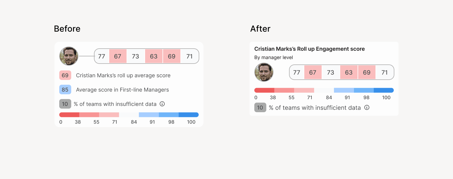
The first version showed ring averages for every organizational level — first-line, second-line, all the way up — visible at all times. The thinking was that more context would help users orient.
In testing, it didn't. Multiple averages competed for attention, and users couldn't tell which one mattered for the team they were looking at.
We stripped it back to one contextual average — for the level the user is currently exploring. Same data, less to parse.
How we knew it worked
What I'd do differently
Visualization alone didn't close the loop. Users still needed to communicate findings — reports, slides, screenshots — and we hadn't designed for that. I saw it from the beginning but didn't push hard enough to scope phase 2 from kickoff: report generation, slide export, screenshot sharing.
Not to build it then, but so the team had it in mind when making architecture decisions. The tool enabled exploration. It didn't enable action.